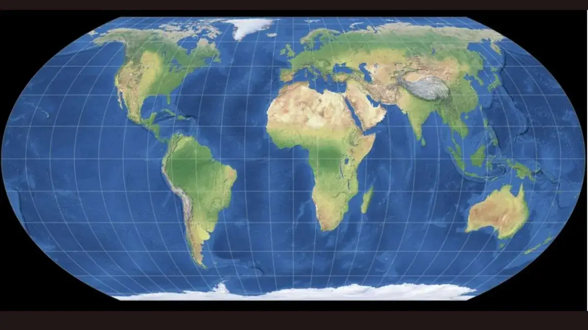
Consider the traditional world map displayed in a classroom or one that you have stored in your smartphone. In such a map, India seems relatively small, like a diamond-shaped continent placed below much larger Russia, Canada, and Greenland.
But that does not mean that India is really that small. The reason behind this is a map projection that is almost 456 years old and was never intended for accurate size display of areas.
Countries and continents, including India, as seen on world maps have seemed to be larger or smaller than they really are. This has been largely due to the fact that the earth is not flat and therefore cannot be accurately represented on flat maps.
The name, year of birth, and a purpose of creation have been attributed to India's distortion.
The Mercator map, which has been most commonly used until now, was created in 1569. The main purpose of the creation of this map was to assist sailors in determining directions and routes while at sea. But unfortunately, this map has greatly distorted the size of the regions closer to the poles; whereas regions closer to the equator, like Africa and South America, look much smaller than they really are.
The Mercator projection maintains angles and directions precisely, which was its strength in assisting navigation. In fact, all straight lines in a Mercator map indicate compass bearing and allow a sailor to follow a straight line course at sea. But this geometric property of the Mercator map has a very high price when this map is used for any purpose other than determining navigation.
It wasn’t an issue that could be prevented with good planning because of its mathematical nature of transforming a sphere into a flat rectangle.
Because it is impossible to perfectly transform a curved globe to a flat rectangle without some form of distortion, every map of the Earth will inevitably involve some form of distortion. Distortion may affect either shapes, sizes, or distances and not all of them simultaneously. For example, the Mercator projection preserved shape and directions for sailors and paid the price of distortions of size.
The problem of the Mercator projection is that it transforms the Earth, which is a sphere, into a cylindrical surface that opens at the poles resulting in a flat map causing scaling distortion.
Without the distortion brought about by the Mercator projection, the scale of India relative to other countries appears completely differently.
For example, in a study conducted by the use of the Peters Projection, it was realized that Scandinavia, at about 0.4 million square miles, appeared bigger than India even though the latter was actually 1.3 million square miles – more than three times the size of Scandinavia.
In reality, India is about three times bigger than the combined size of Scandinavia and that is exactly the reason it has the largest population in the world after surpassing that of China in 2023.
The distortion of India is just one of many more far-reaching examples of distortion of visuals which have been causing a bias in the way regions of the Global South have been visually represented for a long time now.
For instance, while Africa is 1.23 times the size of North America, the Mercator map makes North America appear to be larger than it is. Designer Kai Krause once made an illustrative point of how badly the Mercator map distorts the visuals by placing USA, China, India, Japan and much of Europe within the boundaries of Africa.
Of all the examples of distortion of visuals through maps, the most common example is that of Greenland, which appears to be about the same size as Africa, although in reality, it is only 1/14th the size of Africa, even smaller than a single country in Africa, namely, Democratic Republic of Congo.
And it’s not simply an academic issue anymore since it became a serious diplomatic effort at the UN level.
With this particular UN resolution about the introduction of equal-area projection, India would definitely look larger on the world map despite the fact that there are no changes introduced to the borders, territories and political maps at all. With the reduction of the size of the continents like Europe and North America, India would become relatively larger.
There was definitely a consensus at the international level in relation to the voting on the new map with a larger Africa, but not an absolute one. There were 164 countries including India that voted for the resolution, but not the USA.
In particular, the new projection is not a newly invented map design; rather, it is a relatively new and thoughtfully developed one aimed at addressing the exact problem that Mercator created.
In particular, one of the projections discussed during the UN debate is Equal Earth, which has been created as recently as 2018. As is clear from its very name, the projection is an equal area projection, where countries and continents are mapped according to their actual area. Thus, in terms of their proportions, continents look much more realistic under Equal Earth projection, but their shapes remain recognizable.
In other words, Africa appears to be considerably bigger, close to its real proportions, whereas Europe and North America become smaller. It means that India and other developing countries gain more weight in maps than they have had for the last four centuries.
Although it voted for the UN resolution, India’s own stance regarding the map projection issue has been fairly moderate rather than one of pride.
India has been careful with regard to this issue as it knows very well that although an equal area projection would more faithfully reflect its real geographical dimensions, this change of the cartographic paradigm is all about rectifying a historical mistake and not making an assertion about the size of any particular nation.
It is not just an argument for academics and aesthetic considerations — opponents of the Mercator projection have been arguing that the continual under-representation visually has been impacting people’s perception of how important a country or a continent is, even subconsciously.
Co-founder of Speak Up Africa and one of the prominent figures behind the "Correct The Map" initiative campaigning for the same change on behalf of Africa, Fara Ndiaye, called the domination of the Mercator projection for centuries out right, saying it had been giving a distorted picture of the world through the significant reduction of such regions as Africa along with the enlargement of others.
The "Correct the Map" initiative has managed to achieve some success in the tech industry — Google Maps has been using a 3D view on the desktop since 2018; however, the mobile app is still based on the Mercator projection.
There should be no fear when acknowledging the shortcomings of a solution like Equal Earth, as there is no way to map a sphere onto a plane without a trade-off being made.
According to specialists, many contemporary projections have issues representing particular locations, such as Antarctica, which means that a move to Equal Earth will increase the level of area accuracy, but will not result in the complete removal of distortions – only in their distribution.
Since the United Nations resolution is now officially adopted, and because Google, among other organizations, has already started moving towards a non-Mercator projection system, it may well be that in the coming years, equal area projections such as the Equal Earth projection will start being used far more frequently than they have been up until now.
As for India, it is not as though any of its territory would actually change, but at least one incorrect visual impression that was first drawn almost five centuries ago, by a Flemish cartographer designing a map for some 16th-century sailors, would no longer persist.